

Data in the Shires, thinking big but also small, and Jordan Pickford's water bottle
Plus... GE2024 data story inspiration and join me at Comms Unplugged in September


Manchester. London. Derbyshire.
Firstly, if you are about to start your Summer holidays or will be reducing your hours, I hope you are able to totally switch off from work and spend time with people who matter to you. I know I’m ready for that.
When not watching football, cycling, cricket, Olympics and election coverage, I’ve been out and about a bit this month.
It was wonderful to take part in the Manchester leg of Orlo’s much-loved Tour with some top public sector comms professionals.
I really enjoyed hearing from Wakefield Council’s Laura Hogan about how she and her colleagues have developed a more strategic approach to digital communications. They have really built trust with residents and businesses by embracing data and insights for social media.
Enhancing data skills of a Bcorp’s staff and showcasing the potential of Artificial Intelligence (AI) was the focus of a trip to London in July. I love speaking with comms professionals about data and AI as it matters to all of us - and so it’s great to have been asked to speak to other police communicators on this later in the year.
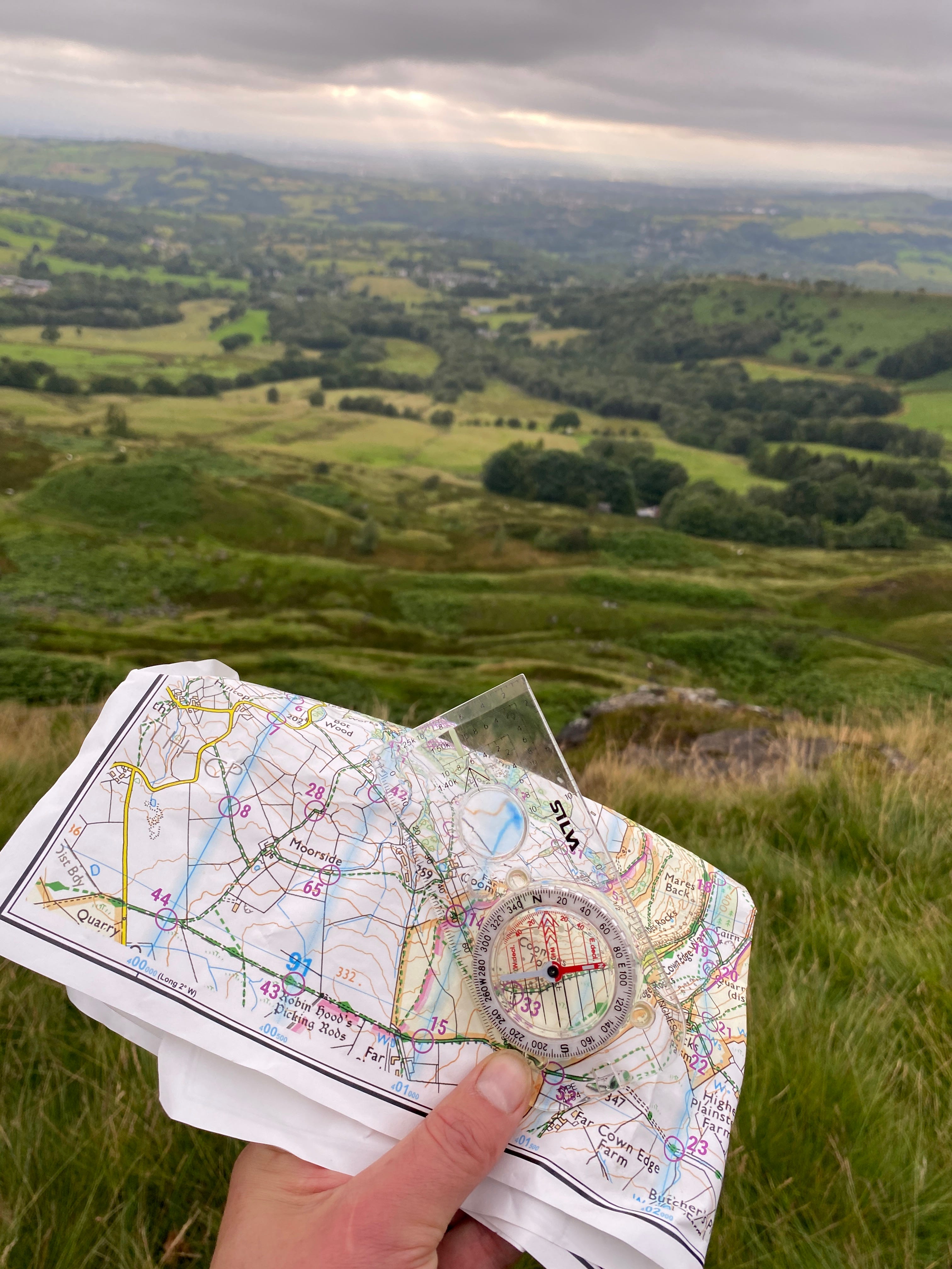
Away from work, with the sun making a very welcome appearance I grabbed the opportunity to do some orienteering in the Peak District.
I love these events, combining exercise, hills, being outdoors, and strong elements of strategy and dynamic decision-making. Using multiple data points (a map and watch) to make good decisions is key.
But of course, I’m also only human and so overestimated my own navigation and running ability… getting home with just 9 seconds to spare.
Have a great Summer.
Spin cycle - or ‘The Problem With Big Numbers’
It was interesting to see West Yorkshire Combined Authority (WYCA) mark a milestone in its sustainable travel aspirations with some data-centred comms.
A very practical example of how data can be used in PR and storytelling, making use of open data from a network of automated cycle counters (available to anyone here).
What was interesting for me was that rather than lifting a series of numbers from the press release, the BBC took a big headline number (3 million journeys on the Bradford Leeds Cycle Superhighway) and did an additional calculation to get a top line. Presumably one it thought more resonant with its readership.
The BBC’s headline ran: ‘Cycle superhighway sees 800 users a day’. Three million is a big number, whereas 800 a day is something a bit easier for our brains to handle. They - or indeed the WYCA comms team - could have crunched a little further, saying on average the Superhighway is used ‘once every two minutes’.
What does this mean for comms pros?
From a PR perspective it can be tempting to go for the big number to impress. Yet, as Elizabeth Toomarian, an educational neuroscientist at Stanford University points out, ‘our human brains are pretty bad at comprehending large numbers.’
Also note a subtle but important error in the BBC’s telling of this data-led story. It says 800 users a day but it is actually 800 journeys a day. This is an important point of clarity as some of these journeys will very likely be people going out and back (for example, for work), and therefore equating journeys to people is likely to give a false picture.
Accuracy matters for communicators when working with statistics, just as it does with word-based facts. And so does using data literacy and critical thinking to hit upon a headline that resonates best with the public and the media.
Data came home, even if football didn’t
A major tournament like the Euros is a data enthusiast’s dream (see here for a little bit of fun I had).
Football didn’t come home in the end, but I loved this example of how England used data (and probably also AI) to give themselves every possible advantage.
This is learning for comms pros around using data to help inform your really big decisions. England keeper Jordan Pickford didn’t go with his gut or ‘feel’ to save penalities, he went with hard and credible data.
You may have seen long lens pictures of a ‘cheat code’ written on the side of his water bottle, which he duly used to help defeat Switzerland in the quarter finals.
The FA has a team of data analysts in place, who I am sure will have been busy in their Euro 2024 preparations compiling complex datasets on potential opponents.
What does this mean for comms pros?
As comms professionals we all have our own penalty shootout equivalents - with reputation, money and maybe even sometimes people’s lives on the line.
At the end of the day - as our England footballing heroes might say in post-match interviews - using data strategically, effectively and creatively to generate unique insights can really make a difference to the final outcome.
Trusting our gut can seem like the natural and comfortable thing to do - but as this Harvard Business Review article points out, it’s also beset with problems.
Good GE2024 data comms
I saw some Public Affairs agencies neatly harnessing free, publicly available data to tell interesting stories around the Polling Day period, which I thought worth sharing for ideas and inspiration:
Inflect used freely and easily available data from the Parliament to publish ‘The Change Election’ - and paint a picture of the experience being lost due to MPs standing down.
56˚ North did some pretty cool qualitative analysis of previous Queen’s Speeches, to see how they have compared to the new Labour government. They went beyond just numbers to do some neat keyword and thematic analysis, demonstrating data savvy that will help further their credentials with clients and decision makers alike.
Inspired by Dicks (no, really)
One of my big pieces of advice when it comes to getting started with data-informed comms is to be inspired by the great work of others.
In recent workshops and presentations, I’ve been showcasing e.l.f. Beauty’s brilliant data-driven So Many Dicks campaign. Seeking to highlight inequality in corporate America, this campaign is a great example of how using public data can give you a creative spark.
Inspired by that clever campaign, I did some analysis on the first names of all candidates standing in the General Election.
There were 56 Richards and 1 Dick. Three Keirs, 1 Rishi, 25 Edwards and 17 Nigels. Five Margarets or Maggie, 32 Tony or Anthonys and 5 Gordons. But no Winstons.
Although just a bit of fun, it did highlight an alarming disparity in the number of male (65%) and female (35%) candidates standing.
It was a good workout for my data scraping, coding and analysis skills - and I even made it into Politico!
Data viz in Dorset in Sept 2024
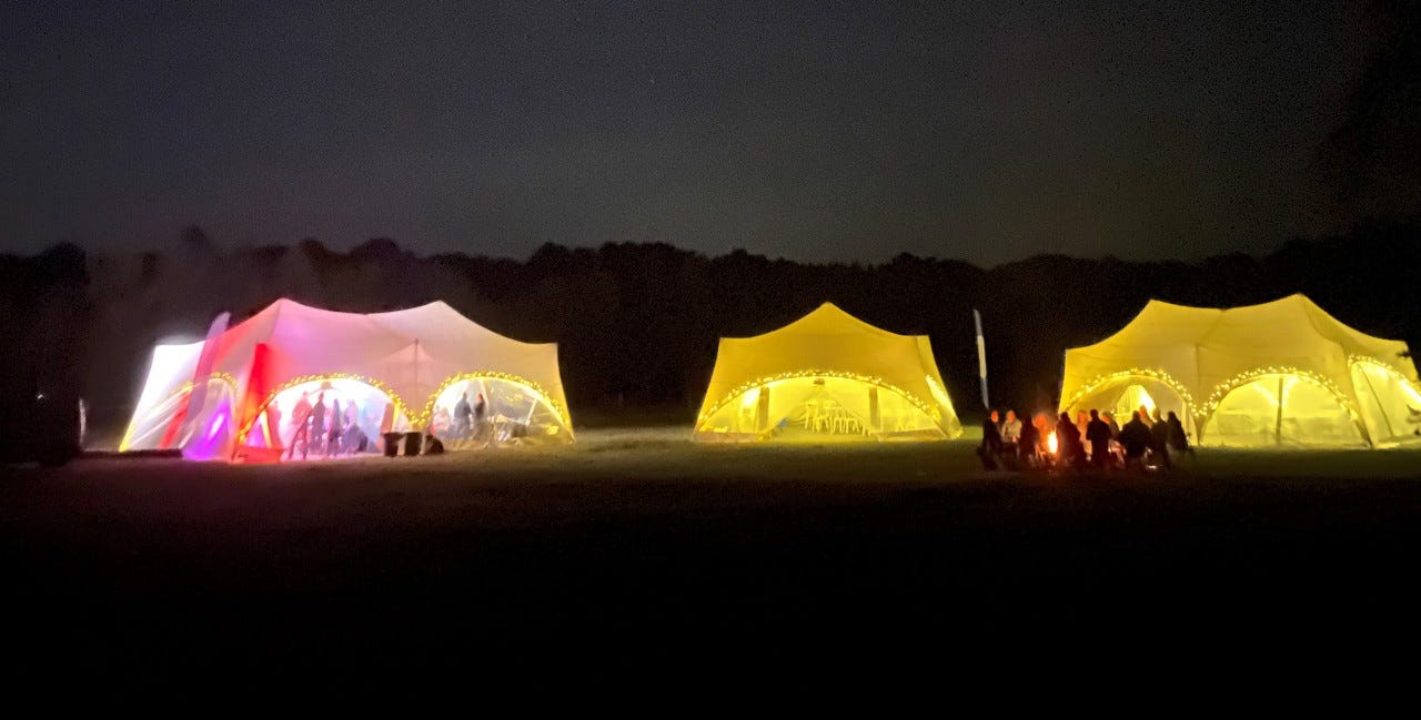
Last call to join me for Comms Unplugged from 12-14 September - a unique two-day event in Dorset for comms pros.
Presenting with the wonderful Sarah Holmes, we will get hands on and creative, showing you how Ripple Maps and visual storytelling can be used to see the impact of campaigns and to capture inspiring people stories.
Comms Unplugged is great for comms pros looking for a unique two days of wellbeing, development & networking - plus live music and campfires - for a bargain price of £230 including food.
Types of work I do, with people just like you
- Workshops: Data literacy (including AI) for comms pros: audience insights, campaign tactics and evaluation.
- Projects: Social media data deep dives, using quantitative and qualitative analysis of big datasets for better outcomes and efficiency.
- Thought leadership: Keynote sessions, 1:1 support and editorial pieces on data in comms.
- Bespoke: Data mining, cleaning and merging of datasets, data for storytelling, thematic analysis of big content datasets, advising on good practice.
If you work in comms and want to make more use of data in 2024 and beyond, drop me a line at alex@whetstonecomms.com. I currently have availability from October 2024.
Data Communications Chronicles is written by Alex Waddington, founder of Whetstone Communications, which helps public sector and not for profit comms teams do more - and deliver more - using data.